A fresh new look
Updating the visual identity for Swedish SaaS company Lexi.
We started working with Lexi as a small start up and have worked closely on all aspects of their communications during their growth and expansion into Asia. After over 10 years it was time for an update of the visual identity we created for them back in 2012.
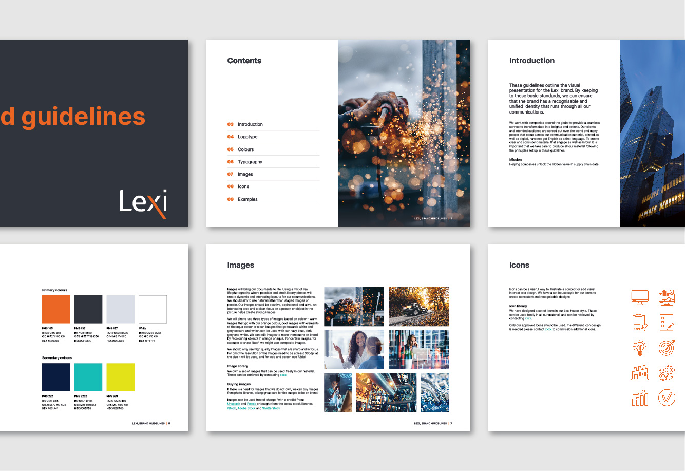
Wanting to achieve a fresh, clean and professional look, we started by simplifying the typefaces, and tweaked the colour palette. A big part of the new identity has been to streamline the image style to really create a coherent identity, together with designing a set of icons to be used in all material.
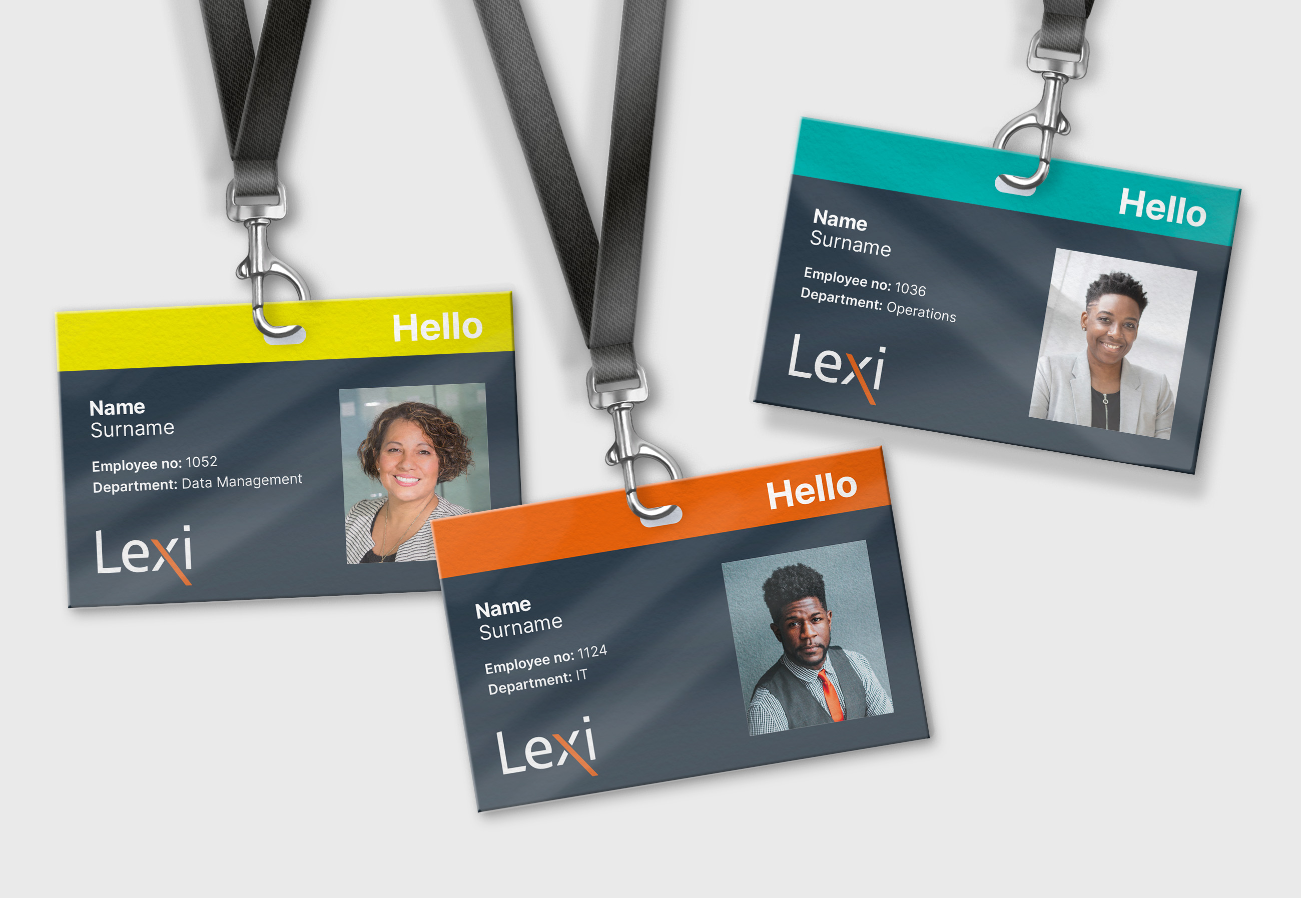
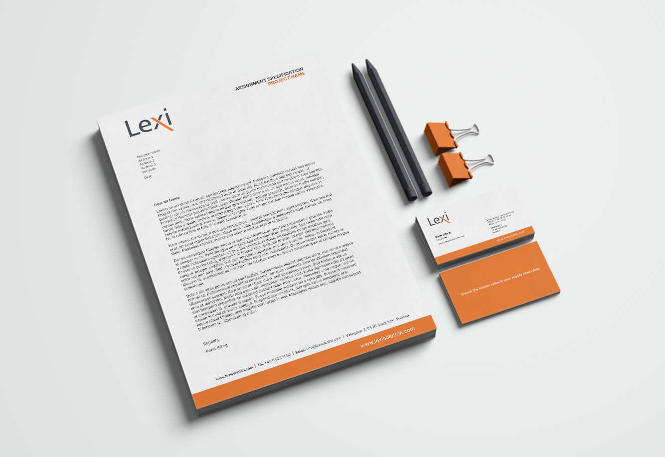
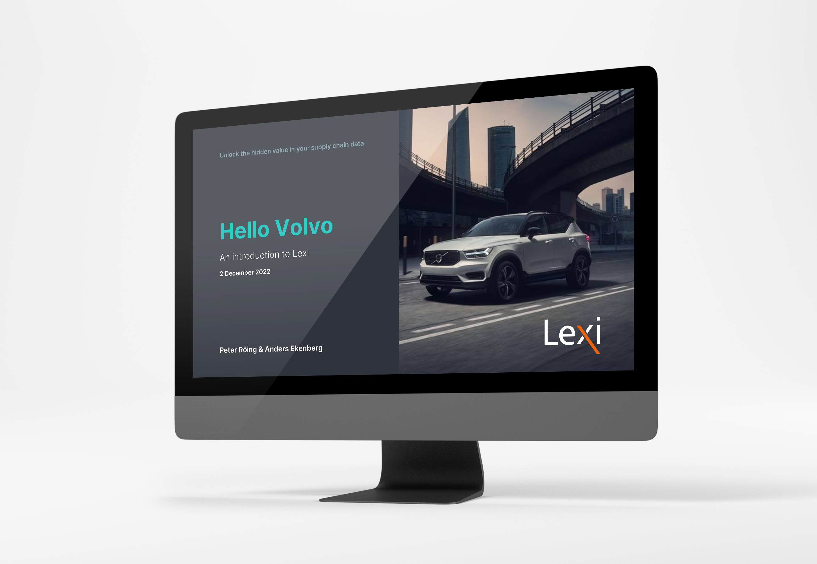
By keeping the look clean and simple, we will achieve a unified professional feel throughout all channels.


“Holmqvist Design has been a valued part of our business since the start. They understand our needs and delivered a great refreshed identity that clearly communicates Lexi’s brand values. The process from start to finish was really smooth. We were very impressed with Holmqvist Design’s highly creative and efficient response to our brief and will continue to use them as our preferred design agency going forward.”
// Peter Röing, CEO, Lexi


